
Overview – Graphs and charts
Graphs and charts are ways of presenting data visually. They make it easier to identify patterns, compare results, and communicate the findings of psychological research.
Different types of graphs and charts are suitable for different types of data. The main types used in psychology are:
Line graph
A line graph is used to show how a variable changes across a continuous scale. The data points are plotted on the graph and joined together with lines.
Line graphs are particularly useful for showing changes over time or comparing how a continuous variable changes under different conditions.
- The x-axis usually represents the continuous variable, such as time
- The y-axis represents the measurement being recorded, e.g. strength.
Line graphs are suitable for continuous data (i.e. data that can take any value within a range rather than only specific whole-number values). They can also be useful when comparing more than one set of continuous data – so different lines can represent different participants, groups, or conditions.

For example, the line graph above represents how 3 participants’ strength changed during a strength training programme. The x-axis represents the training time and the y-axis represent the person’s strength.
The line graph enables the researcher to visually represent whether strength increased, decreased, or stayed the same over the course of the programme.
Key points:
- Used to show changes in continuous data.
- Particularly useful for showing changes over time.
- The x-axis usually shows the continuous variable.
- The y-axis shows the measurement being recorded.
- More than one line can be used to compare different groups, participants or conditions.
Pie chart
A pie chart is a circular chart divided into sections. Each section represents a category and shows how much of the whole belongs to that category.
Pie charts are useful for showing the relative frequency – i.e. the ratio, fraction, or percentage – of different categories. The whole pie represents 100% of the data, so each section shows the proportion of the total represented by that category.
Pie charts are suitable for categorical data (i.e. data that can be divided into distinct categories), such as nominal data.
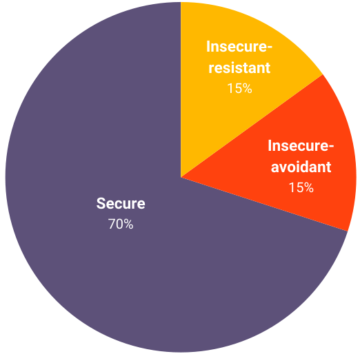
For example, the different attachment styles identified in Ainsworth’s Strange Situation could be represented using a pie chart like the one above. Each section represents an attachment style such as secure, insecure-avoidant, or insecure-resistant.
A larger section represents a category that occurred more frequently and a smaller section represents a category that occurred less frequently.
Key points:
- Used to show how categories make up a whole.
- Useful for displaying percentages or proportions.
- The whole chart represents 100% of the data.
- Each section represents a different category.
- Best suited to categorical data.
Bar chart
A bar chart is used to compare the frequency or results of different discrete categories.
- The x-axis lists the categories
- And the y-axis displays the results or frequency of these categories.
The bars are separated by gaps because the categories are separate from one another. There are no values in between the categories.
Bar charts are useful for comparing the results of different experimental conditions or categories.
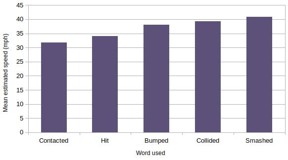
For example, the results of Loftus and Palmer (1974) could be presented using a bar chart like the one above. The x-axis shows the different verbs used in the questions (Contacted → Hit → Bumped → Collided → Smashed) and the y-axis shows the estimated speed reported by participants.
There are gaps between the bars because each bar is a separate category. There is no meaningful category in between ‘contacted’ and ‘hit’, for example, so the bars of a bar chart do not touch, unlike a histogram.
Key points:
- Used to compare discrete categories.
- The x-axis shows the different categories.
- The y-axis shows the frequency or result for each category.
- There are gaps between the bars.
- Useful for comparing different experimental conditions.
Histogram
A histogram is similar to a bar chart, but it is used to represent continuous data (i.e. data that can take any value within a range, including values between whole numbers).
- The x-axis is divided into intervals
- The y-axis shows the frequency of scores within each interval.
Because the data is continuous, the bars in a histogram touch each other – there are no gaps between the bars.
Histograms are useful when there are many possible values within a range. For example, people’s weight is continuous data. A person could weigh 60 kg, 60.1 kg, 60.25 kg, 60.257 kg, and so on. Rather than showing every possible value individually, the values can be grouped into intervals.

For example, a researcher could record the IQ scores of participants in a psychology study. The x-axis divides the IQ scores into intervals (<55 → 56–70 → 71–85 → 86–100 → 101–115 → 116–130 → 131–145 → >146) and the y-axis shows the frequency, or number of participants, whose IQ falls within each interval. Because IQ is treated as continuous data, there are no gaps between the bars (unlike a standard bar chart).
Key points:
- Used to represent continuous data.
- The x-axis shows intervals of values.
- The y-axis shows the frequency of scores within each interval.
- The bars touch because the data is continuous.
- Useful for showing the distribution of scores.
Scattergram
A scattergram is used to show the relationship between two variables. Each point on the graph represents one data point, such as an individual participant.
- The x-axis represents one variable
- The y-axis represents the other variable.
Scattergrams are particularly useful when psychologists are investigating whether there is a correlation between two variables.
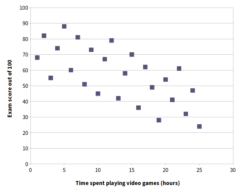
For example, a researcher who investigated whether there was a relationship between the amount of time students spent playing video games and their exam scores could represent their findings in a scattergram like the one above. The x-axis represents the number of hours each student spent playing video games the week of the test and the y-axis represents the student’s exam score. Each dot would represent one student. For example, the dot in the bottom-right of the scattergram above represents one student who played video games for 25 hours and scored 24 on the exam.
The pattern of points can then be used to identify whether there appears to be a relationship between the two variables. If the points generally rise from left to right, this suggests a positive correlation. If they generally fall from left to right (like the example above), this suggests a negative correlation. If there is no clear pattern, this suggests no correlation.
Key points:
- Used to show the relationship between two variables.
- Each point represents one participant or data point.
- The x-axis shows one variable and the y-axis shows the other.
- Useful for investigating correlations.
- The pattern of points can suggest a positive, negative, or no correlation.